***
←
→
EDA
[Exploratory Data Analysis]
|
For today
- what is EDA
- why do EDA
- how to do EDA
- examples
What is EDA
EDA is exploratory, initial, cursory look at data.
What is EDA
Note that in EDA, we use the data that serves as input for the rest of the pipeline (DM, ML...) - we do not do EDA on the RESULTS of data analysis!
What is EDA
So EDA is a 'front end' (early in the pipeline) step).
Why do EDA
The purpose of doing EDA is to "get a feel for" the data we want to analyze.
Why do EDA
Especially if the dataset is 'foreign' to us, we could benefit from knowing something about the data - this might help us prep it better for analysis, help us understand the analysis results better.
Why do EDA
EDA is not a 'detailed look' - that happens during the actual analyis (data mining, machine learning etc) stages.
With EDA, we simply want a SUMMARY view of the (input) data. But why? Because we want to learn about the structure of the data [including outliers] so that we can pick the most-suitable model for it, as suggested by the data itself.
How: summary of data
Given some data about a single quantity, eg. incoming GPAs of all 2018 USC Freshmen, here are things that we can compute from/about it:
Here is a doc [from the University of Leicester ("Lester")] that explains dispersion measures nicely.
How: visualizing summary stats
A 'boxplot' (aka box-and-whisker plot) is used to display distribution of data, using five values based on quartiles (min, Q1, Q2(median), Q3, max), into four groups: min to Q1, Q1 to Q2, Q2 to Q3, Q3 to max.
The IQR (middle two groups in the list above) is shown as a box, and the other two groups are 'whiskers' that lie on either side of the box. Outliers are on either side of the whiskers.
A boxplot is a quick way to learn about the dispersion, skewness and outliers in data.
Here is how to interpret a boxplot. This is another description [from The College of Saint Benedict and Saint John's University].
Here are two more pages that talk about boxplots etc:
* BioTuring
* Data Science Discovery
How: scatterplot
The goal of data analysis is to discover relationships between variables ('columns'), when we have data for multiple variables ("multivariate data"). To do this, we need to be certain that those variables have a correlation (with the variable we want to predict, ie the target variable).
We can explore pairs of variables ['bivariate analysis'] at a time (to see if they correlate), using a 'scatter plot' that plots all (x,y) pairs of data points. Eg. here is a scatterplot:
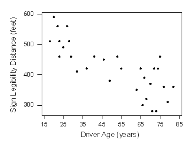
Here is more, on scatterplots.
If the scatterplot between vars y and x show no correlation, it means y (or x) has no dependency on x (or y), so we should not include this pair in our modeling of the data.
A scatterplot might have prevented the 1986 Challenger Space Shuttle explosion :(
This is another page on scatterplots.
While a scatterplot visually shows a collection of (x,y) data, how would we quantify the association between them, ie. how well the data points are correlated? Ans: we'd calculate the Pearson correlation coefficient for it - a single -1.0..1.0 value that expresses the strength of the association.
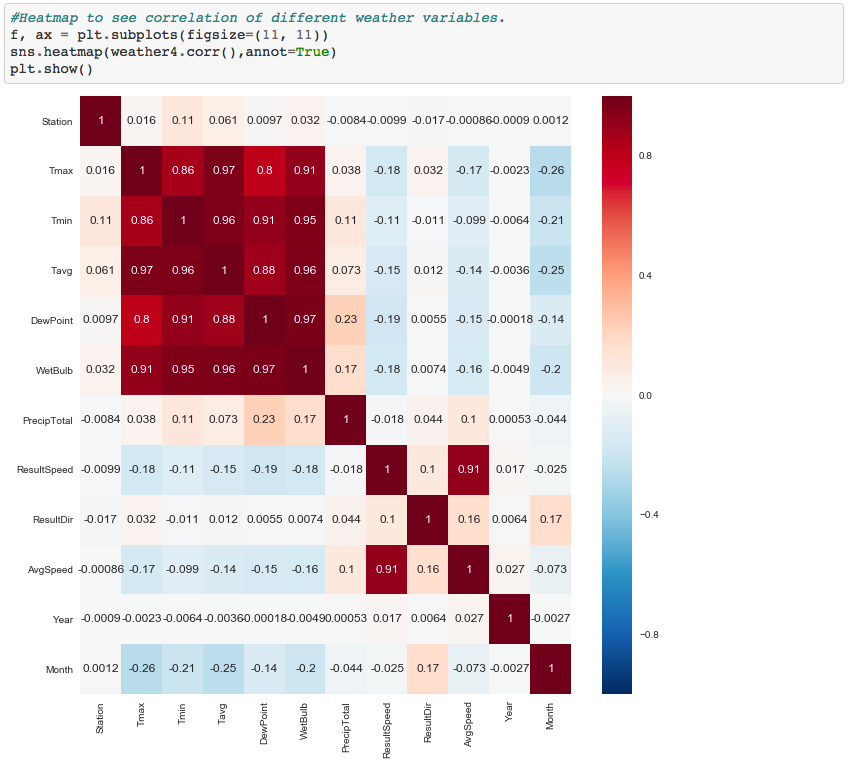
How: heatmap
Rather than do bivariate (pairwise) scatterplots, what if we could visualize all correlations (every var, with every other var) together, ie. in a multivariate analysis fashion? Such a diagram is known as a heatmap:
Case study: lower back pain
Here is EDA, on data related to lower back pain. Python is used, for the EDA computations and plots.
Case study: GitHub developers
In this book [on mining social data], pages 148-173 discuss EDA on developer data [coding languages, number of forks, etc]. R is the coding language used for the EDA.
An EDA walkthrough (in R)
Here is a page that contains code+notes, on an R-based EDA tutorial [it links to a full online book; in an upcoming lecture we'll cover the varieties of tools, frameworks and platforms you can use to do data science: from those, you can pick one for R, then do the tutorial hands-on.
EDA: learning more
Here is a NIST document that offers a thorough presentation of EDA - be sure to go through the parts we covered, eg. boxplot [section 1.3.3.7].
You could even do a course on EDA.