Visualizationof data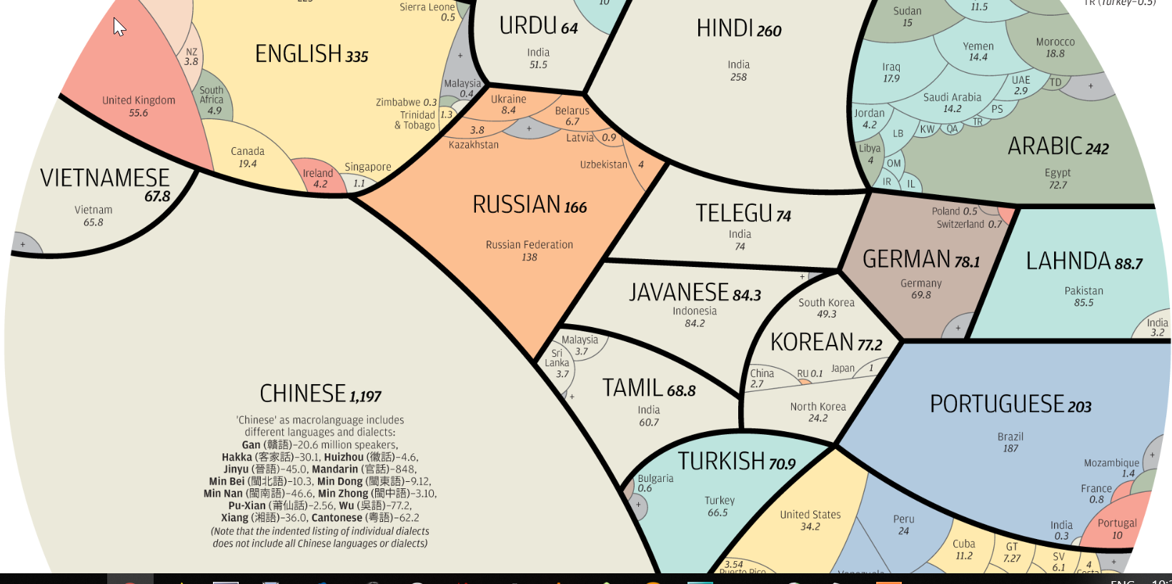
|
Visualizationof data
|
Data!

Data visualization ("data viz") involves (the study of) tools and techniques for turning data into images/graphics - to obtain BETTER INSIGHT into the data.
In other words, this is about graphical depictions of data. Why do it? To understand, communicate, act/decide/utilize.
In what follows, we are going to look at what can be visualized, and how. Note: it's not all 'Big Data' viz, it's not all 'mined' results either.
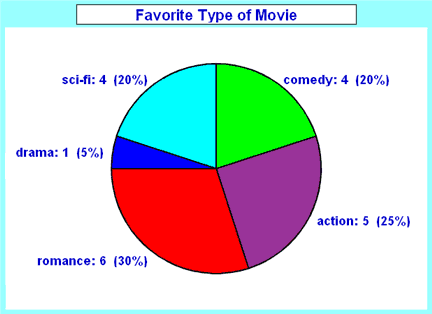
Classically, a pie-chart can be used to express relative fractions of a quantity:
A histogram/bar-chart can be used as well:
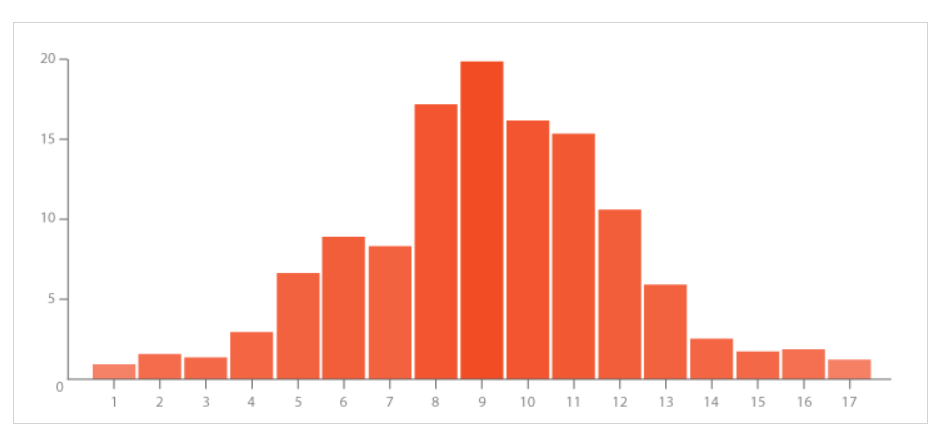
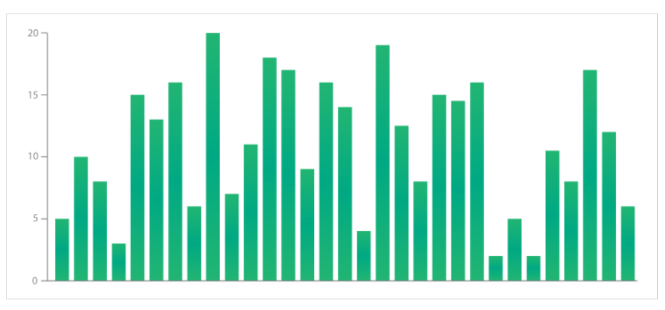
Also lookup: double histogram, density plot.
Bubble plots are also useful:
Wordles can be used to indicate relative strengths of keywords/topics. It is easy to create your own.
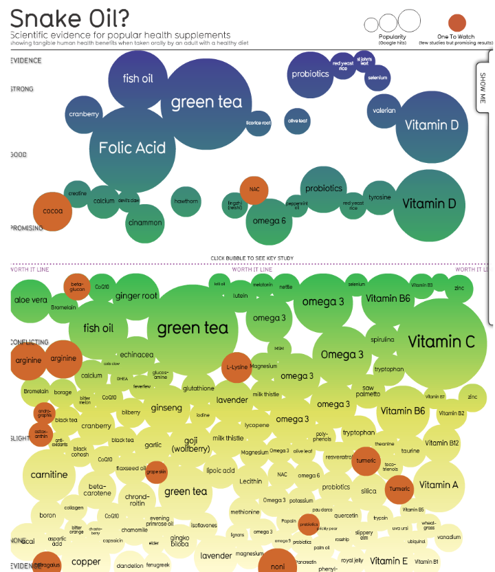
Simple graphics (bar charts, pie charts...) can be made more pleasing, using modern typography and layout techniques - here is a case in point.
Edward Tufte calls the graphic below, ""The greatest statistical graphic ever drawn". Adapted from Wikipedia : 'Charles Minard's 1869 chart showing the number of men in Napoleon's 1812 Russian campaign army, their movements, as well as the temperature they encountered on the return path.' Specifically, the graph shows these 6 types of data (in 2D!): the number of Napoleon's troops; the distance traveled; temperature; latitude and longitude; direction of travel; and location relative to specific dates.
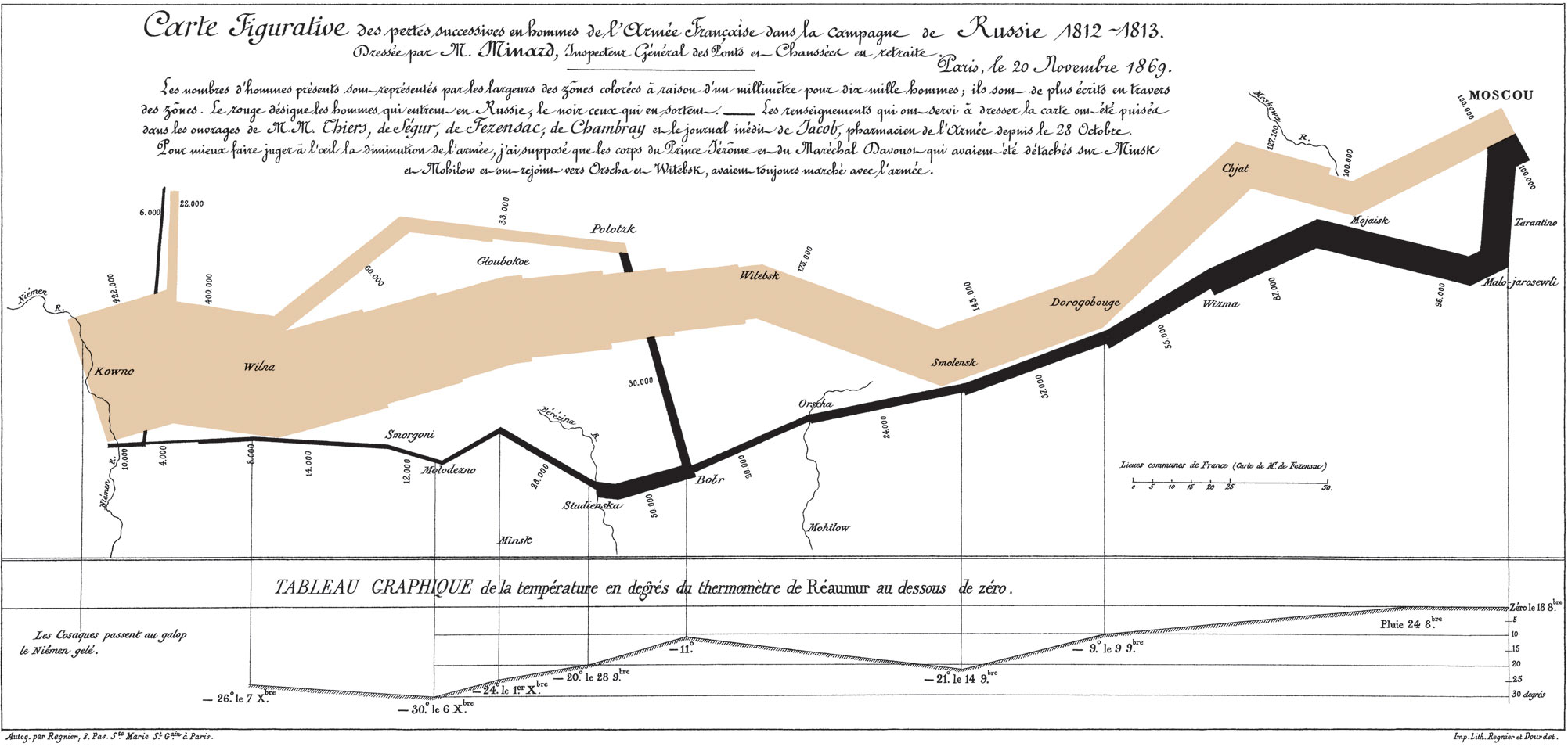
You can read more, here.
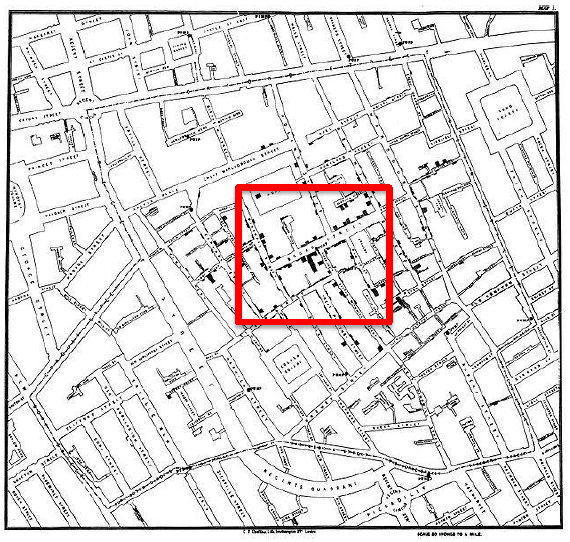
Plotting spatial data (eg. incidence locations) on a map reveals patterns/trends in a 'direct' way - maps are 'intuitive' to humans...
Cholera outbreak map, 1854, London [plotting of reported cases as black dots reveals the source of the outbreak [highlighted region]):
It is quite useful for planning purposes, to visualize data over a map - eg. here are Starbucks locations..
Mined data, eg. associations, can be superposed over a map, eg. in a grocery store. Results can be used to redo the layout. A related topic is product placement.
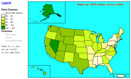
As we saw earlier, a choropleth map shows spatial, aggregated data (that covers the entire region shown). These come in two varieties - unclassed (continuous scale), classed (discrete ranges).
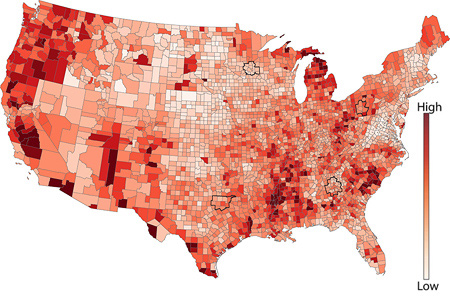
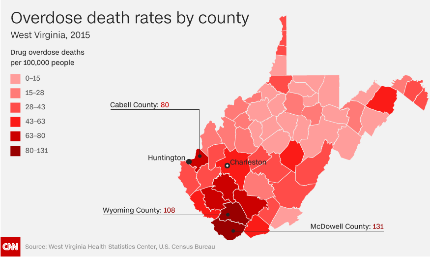
And, more topical - here's a COVID-19 distribution map [choropleth, bubble types]. This shows a classed choropleth, segmented by US counties.
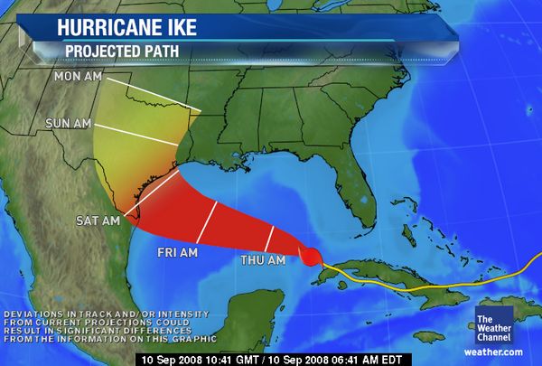
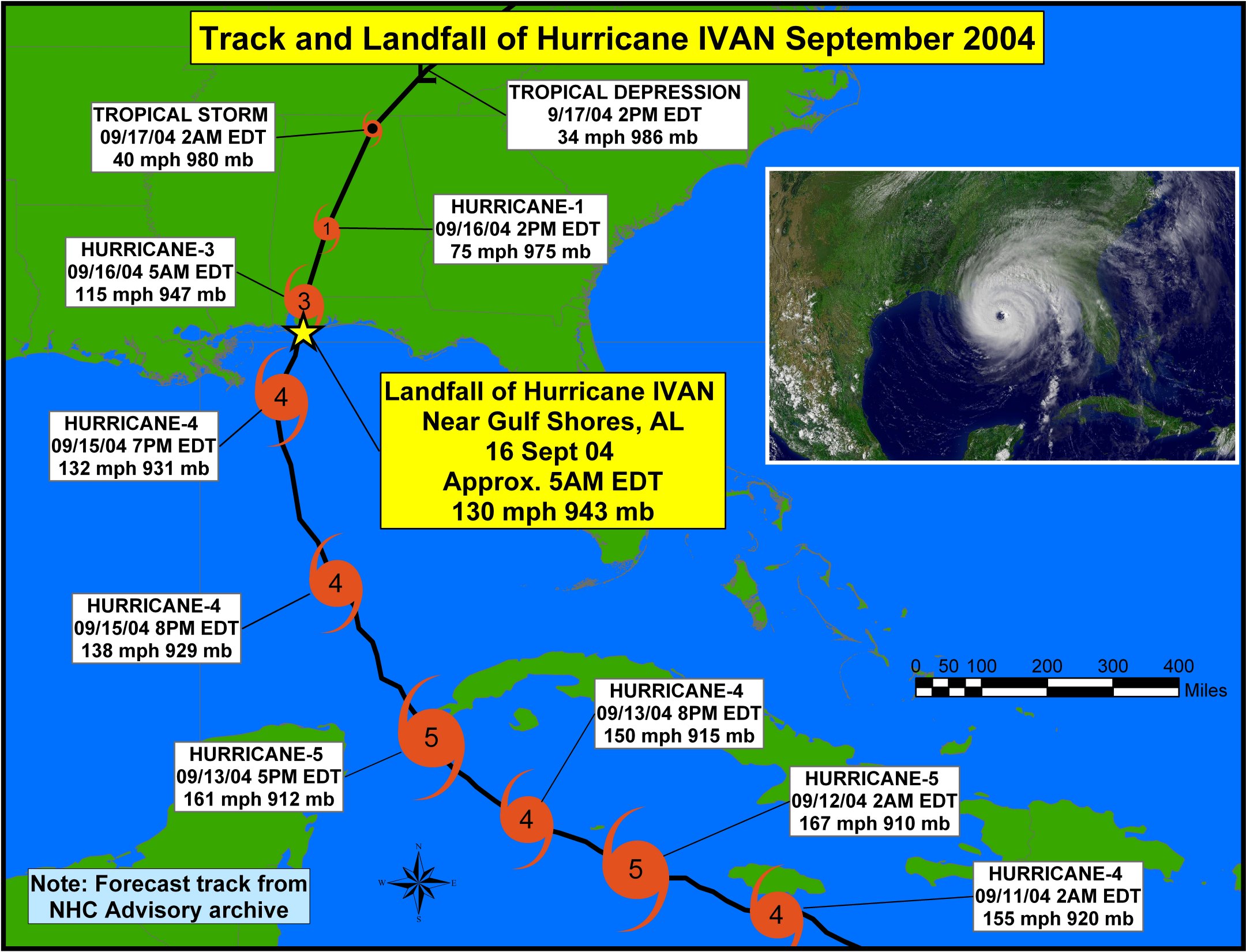
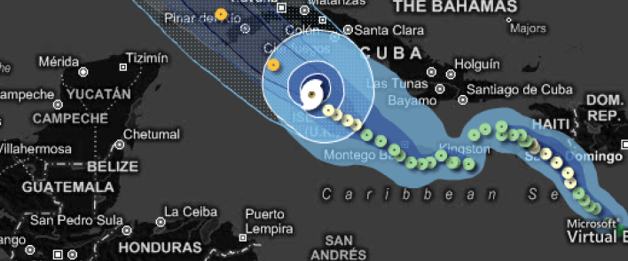
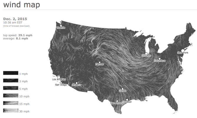
Superposing time-varying data on a map reveals course, trends, etc. Such data could be visualized as animations, too.
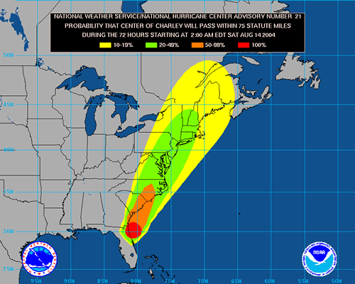
![]()
Here is a different way to display spatio-temporal data [clickable] - using a speedometer-like needle/gauge symbol.
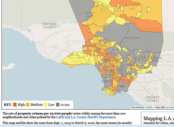
Being able to INTERACT with data provides MORE understanding - we can selectively turn items on/off, drill down or roll up, explore the time dimension..
Crime map, USC area :(
Crimean War casualties, by Florence Nightingale (!) Here is a non-interactive version [I did the interaction and recorded a clip of it], and some background on the 'evidence-based healthcare' that Ms. Nightingale pioneered.
NOAA, Historic Hurricane Tracks [eg. under Name/Year, type in 'Katrina 2005']
Even passively watching data being animated, provides us fresh perspectives.
Eg. here is a spatio-temporal hurricane map.
Population change, as measured by census data, is always interesting [there are more lovely, informative animations at the parent subreddit.]
Here is a different way to visualize relative change of a single variable over time. This is another currently relevant example.
Real-time visualization provides a level of immediacy/freshness/relevance/interest that is simply absent in non-real-time data..
• world population growth [even more real-time stats!]
• local traffic (click on Options->Road Conditions->Fast--Slow) [amazing]
• stocks
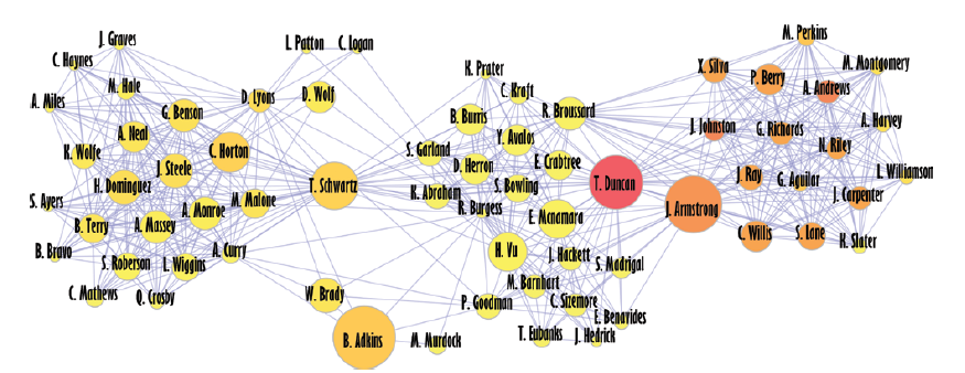
Network visualization is a very popular category - shows RELATIONSHIPS between entities.
A diagram that maps email exchanges between family members:
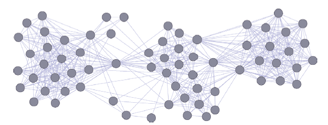
In the above, we are lacking DETAIL that can be added using extra ATTRIBUTES, and LABELS. Here is an enriched version that uses attrs and labels:
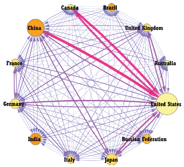
We can use edge attrs (type, eg. arrows, dashes.., color, thickness etc.) to quantify data. The diagram below shows trade quantities between countries (2012, top 12 countries as per GDP):
An assortment of 'cool' (visually appealing) and USEFUL data visualizations:
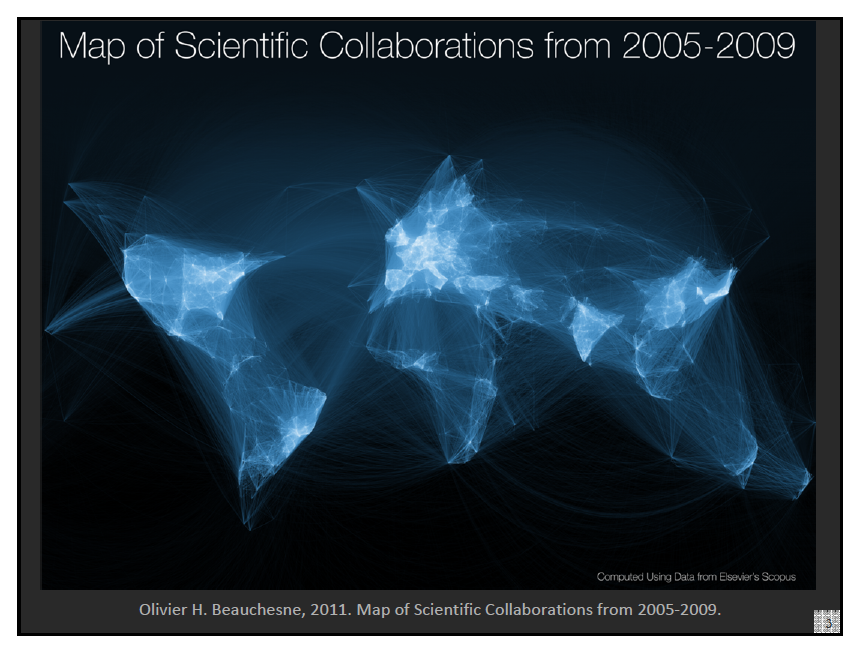
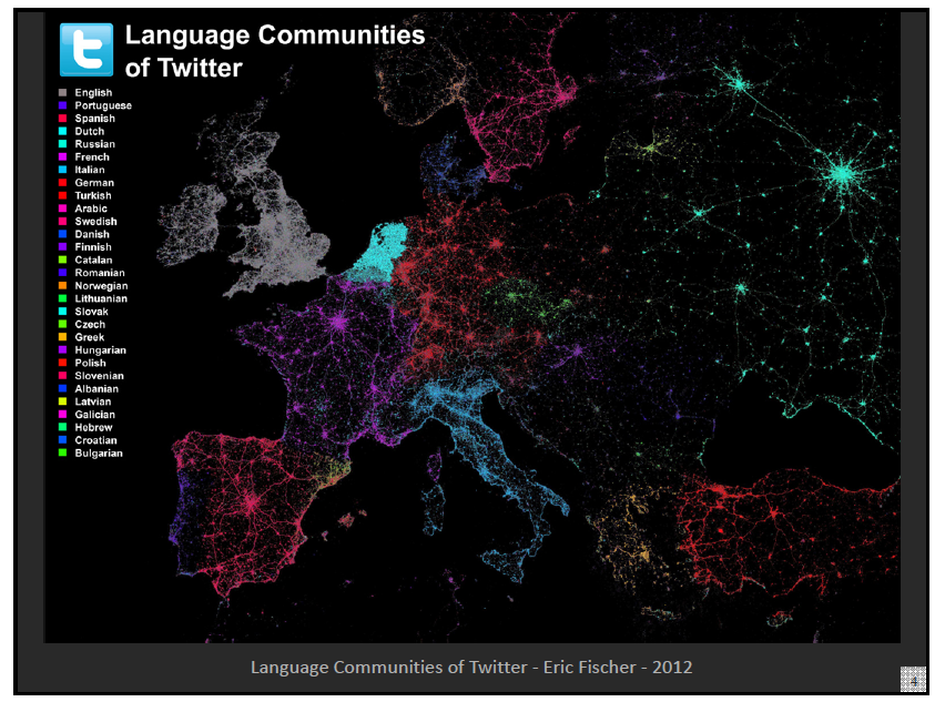
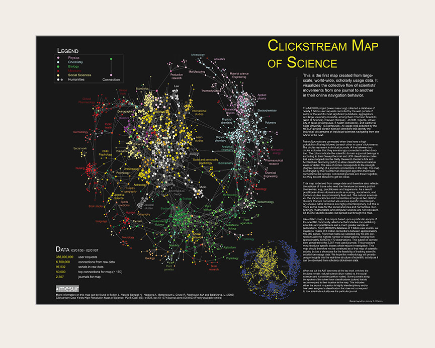
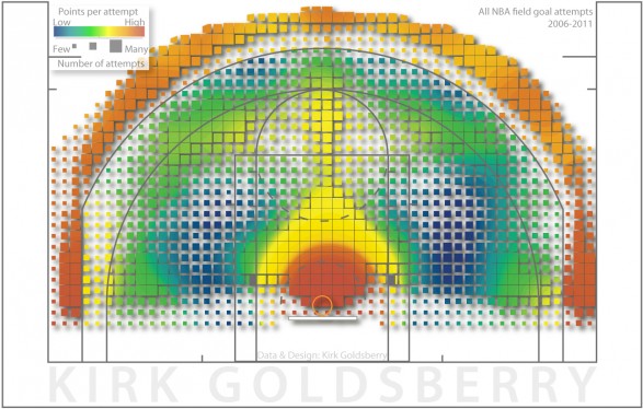
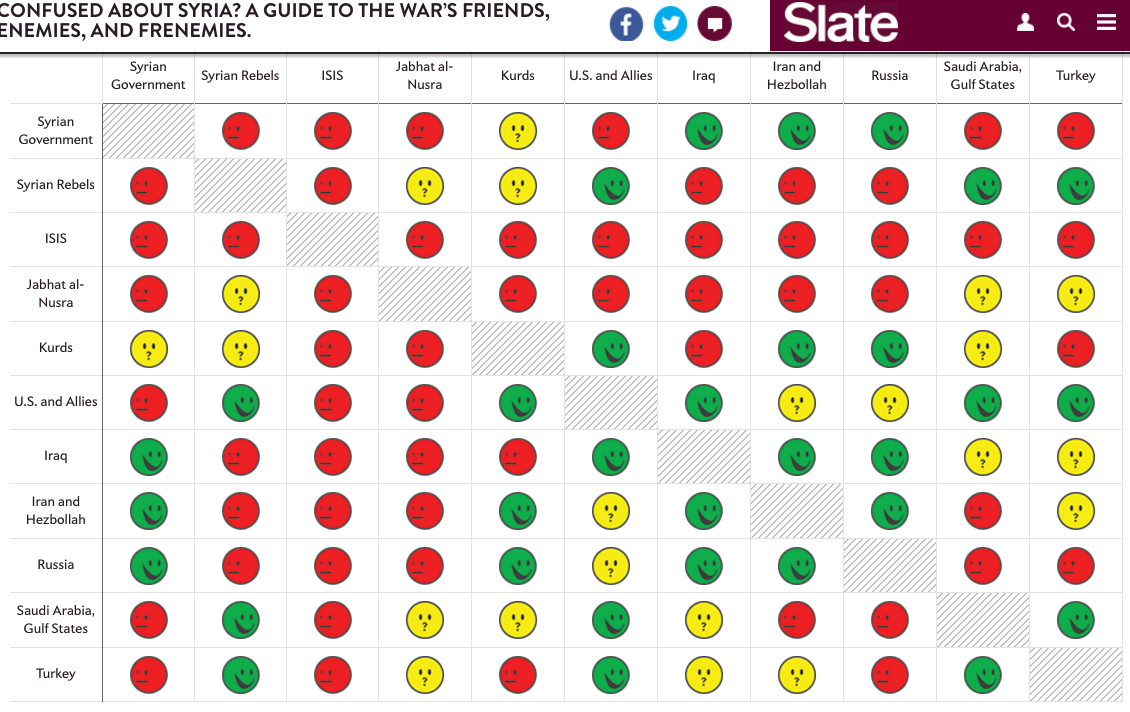
[from here]
Here is more eye candy.
This is a 'histomap' that puts history in perspective.
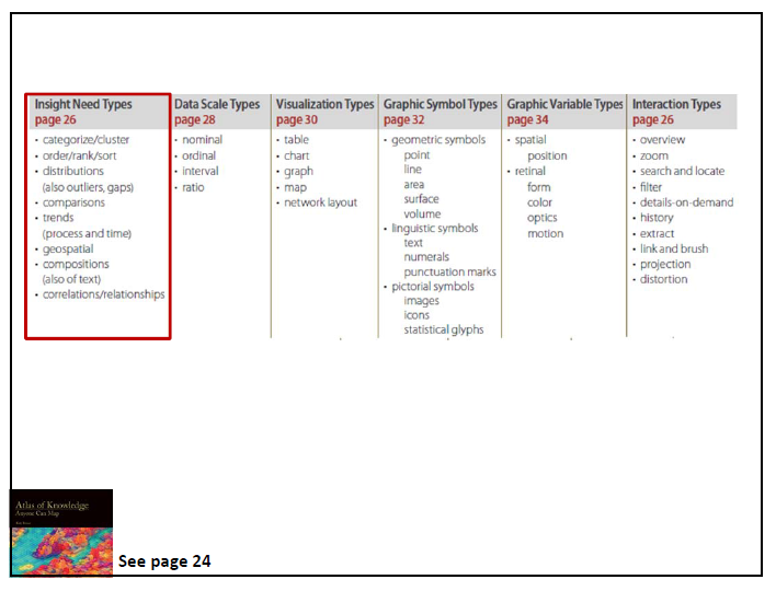
During the past lectures, we've looked at a few data viz examples (eg. GIS data). Here is a systematic breakdown of ways to create all manner of data viz.
As an exercise, learn to use AS MANY of these as you can! Use notebooks for R and Python, and CodePen/jsfiddle for JS.
Data viz is an art AND a science - there are principles, choices, tradeoffs. As for the principles, these encompass diverse disciplines such as visual perception, color theory, composition (grouping, contrast, harmony, symmetry..), design elements (line, tone, form, texture..), semiotics, etc.
As for what type of graphic to generate for a given type of data analysis, we can follow the guidelines here (from 'Atlas of Knowledge'):

USC's INF554 is a data viz course.
Induce the viewer to think about the substance rather than about methodology, graphic design, the tech of graphic production, or something else. (Edward Tufte)
Here is a brief whitepaper from SAS, that discusses data visualization.
Here's an inspiring TED talk...
InfoWeTrust: https://infowetrust.com/
Terrible Maps: https://www.reddit.com/r/terriblemaps/ - fun w/ mapping...
http://www.datavis.ca/gallery/
Some you've seen, some you haven't: https://www.tableau.com/learn/articles/best-beautiful-data-visualization-examples